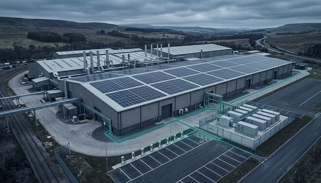

Metered vs modelled energy data: what is the difference and why does it matter?
Metered data is a record of what a system actually generated. Modelled data is a projection of what it was designed to do. The difference matters the moment someone asks for evidence rather than a headline number.
Metered energy data is a recorded figure from an installed system — what it actually generated at a specific site, during a specific period. Modelled energy data is a projected figure from a system's design specification, calculated before installation based on expected conditions. The difference matters when someone asks a harder question than the headline number, and those questions are coming from more directions than they used to.
What is metered energy data?
Metered data comes from the metering and monitoring connected to a live system, recording what it produced, when, and at which site. What a figure actually represents depends on where the meter sits: generation, import and export meters answer different questions, and a metered figure is only as good as its boundary, its configuration and the completeness of the record.
It is worth separating the two halves of that. Inverter-reported figures are valuable for day-to-day operational visibility, but where a number has to stand up to scrutiny, what matters is a properly commissioned meter at a defined boundary. Because Nuvolt designs, installs and monitors the systems it delivers, that data starts recording from commissioning — not added after the fact.
What is modelled energy data?
Modelled data is the projected output from a system's design specification, typically calculated during the feasibility or design phase before installation. It is a projection of what the system was designed to do under expected conditions, not a record of what it did.
That does not make it redundant once the system is live. Modelling is what lets you weather-normalise a comparison, forecast future output, and spot a fault — because a fault only shows up as a gap between what the system should have produced in the conditions it actually experienced, and what it did.
The two together
Neither figure means much in isolation. A meter tells you the system produced 412 MWh last year; it cannot tell you whether that is good. The model tells you what it should have produced; it cannot tell you what happened. Set them side by side, adjusted for the conditions the system actually experienced, and you get the answer that matters: is this investment doing what it was designed to do?
Which is also why a shortfall against the model is not automatically a fault. Several things move output legitimately:
- Irradiance. A dull year produces less. Comparing one year's kWh to the next without normalising for weather is not a performance comparison.
- Availability and downtime. Time when the system was off — inverter faults, grid outages, planned maintenance — has to be accounted for, not averaged in silently.
- Shading changes. A tree grows, a neighbouring unit gets an extension. The site changed; the original model did not.
- Curtailment. On a constrained connection, output can be limited deliberately. That is a network condition, not a system fault.
- Degradation. Panels lose a small, predictable amount of output each year. Year 8 should not be measured against year 1.
A gap between the two numbers is a reason to look, not a verdict. What matters is that you can run the comparison at all.
Why does the difference matter for reporting?
A procurement team asking for evidence behind a supplier's sustainability claims, a lender attaching conditions to how progress is demonstrated, or a board member asking what is behind the number on the slide — all of them are asking for a record, not a projection. Reporting frameworks, financing conditions, and procurement questionnaires increasingly ask which of the two a figure is. The businesses that handle follow-up questions with confidence are usually the ones who can point to metered figures, not just modelled ones.
What does a strong evidence trail look like in practice?
Well-kept operational data does not automatically make a claim audit-ready — no single dataset satisfies every reporting framework. What it does is make the underlying evidence easier to produce and easier to defend. That means a recorded generation figure tied to a specific site and period, rather than an estimate reconstructed after the fact. A baseline to measure against. And the ability to answer a follow-up question without a spreadsheet assembled the week the request arrived.
It is worth being precise about what that record does and does not settle on its own. Measured kWh is an input to a carbon claim, not the claim itself — reporting under the GHG Protocol's Scope 2 guidance also needs the right organisational boundary, an appropriate emissions factor and a consistent accounting method. The meter contributes one number to that calculation; it does not complete it.
Where does the gap usually show up?
The gap tends to appear when monitoring was added as an afterthought — once someone realised there was no visibility — rather than specified as part of the system from the outset. Closing that gap retrospectively is a harder job than avoiding it. If your organisation is starting to face more detailed questions about its energy or carbon performance and you are not confident how easily you could answer them, that is worth looking at before the pressure is on.
Frequently asked questions
Talk to us about your site's energy data
We are happy to talk through what good visibility should look like for your operation.
Talk to us about your energy data